
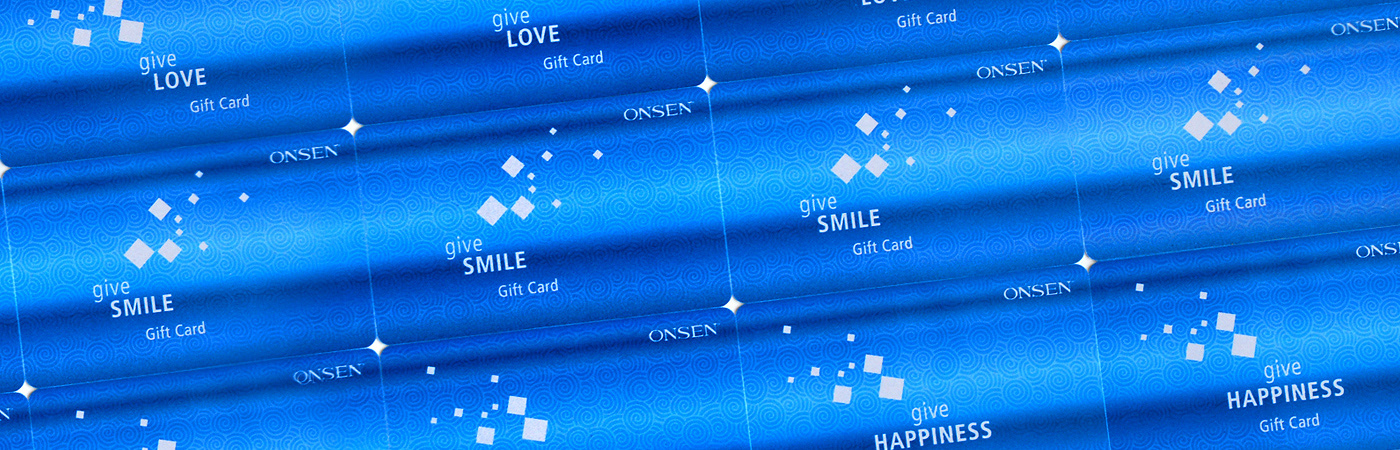
Gift Cards
Idea and design for a set of gift cards
OBJECTIVE: gift cards set design
REQUIREMENTS: white squares, company logo on the cards
REQUIREMENTS: white squares, company logo on the cards
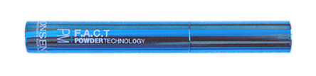
The main cosmetic product of the company - the shinny blue metal container with white powder, had inspired me to use the blue gradient color on the gift cards. The white squares (a part of the client requirements) symbolize in this case the contents of the container - the white powder.
I chose the pattern of spirals seen on the card in order to hint at "onsen" , Japanese hot spring, (Japanese drawings, waves). ONSEN is the name of the client's company, and whole concept of their products is based on the minerals and water from Japanese hot springs