
Identity for a bike ride
[from London to Amsterdam]
OBJECTIVE: to create identity for a fundraising bike ride for Success for Kids (SFK).
REQUIREMENTS: to utilize same colors and font type as in the official charity logo*

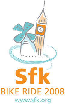
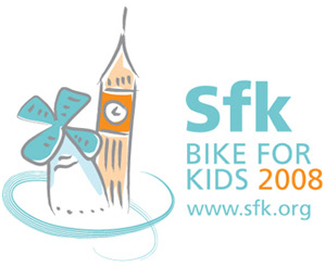
Bike ride logo
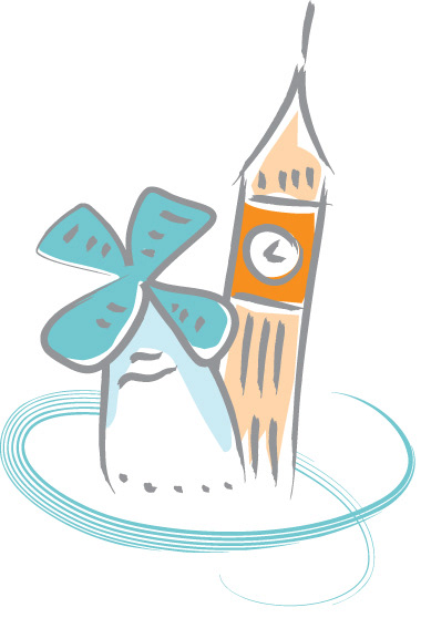
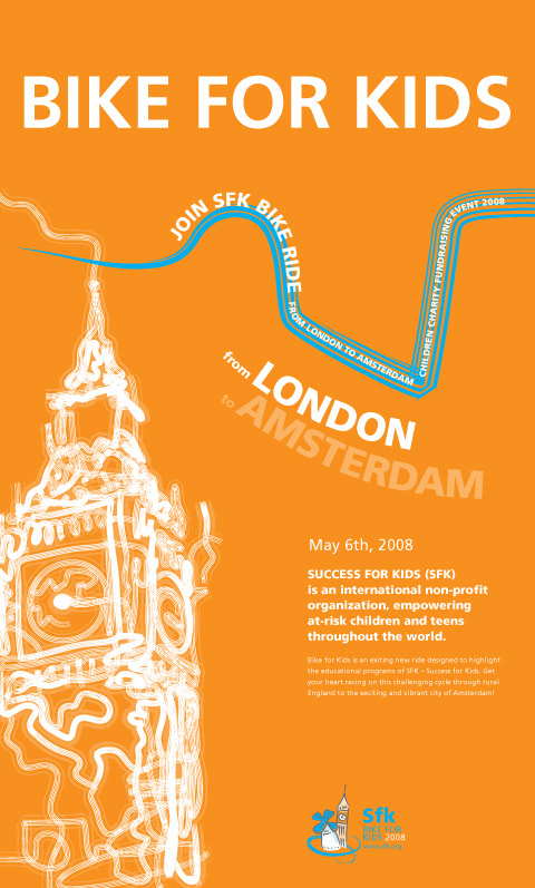
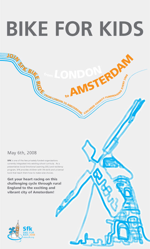
The logo includes main symbols of the two cities: the Big Ben of London, and a windmill of Amsterdam.
Horizontal and vertical options of the logo:
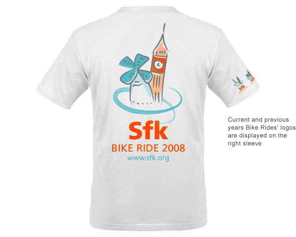
Each participant received 3 T-shirts with the logo for the 3-day bike ride. Current and previous years bike rides' logos are displayed on the right sleeve.

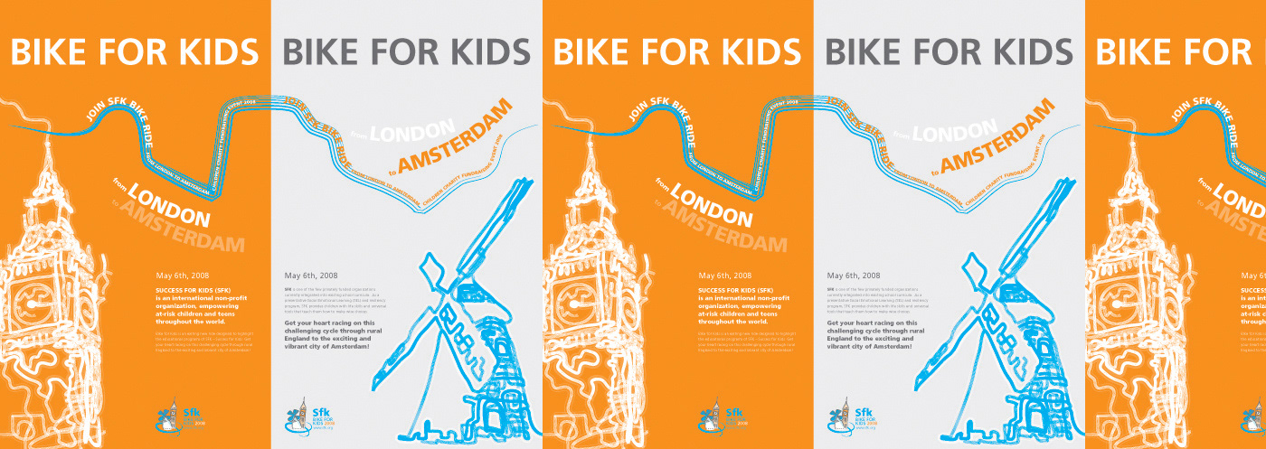
Posters
2 posters promoting the bike ride can be displayed independently or together.
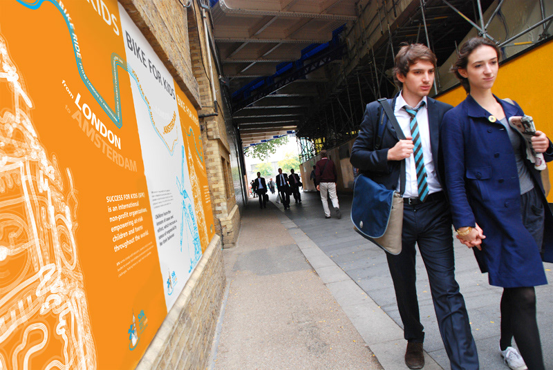
Posters on London streets
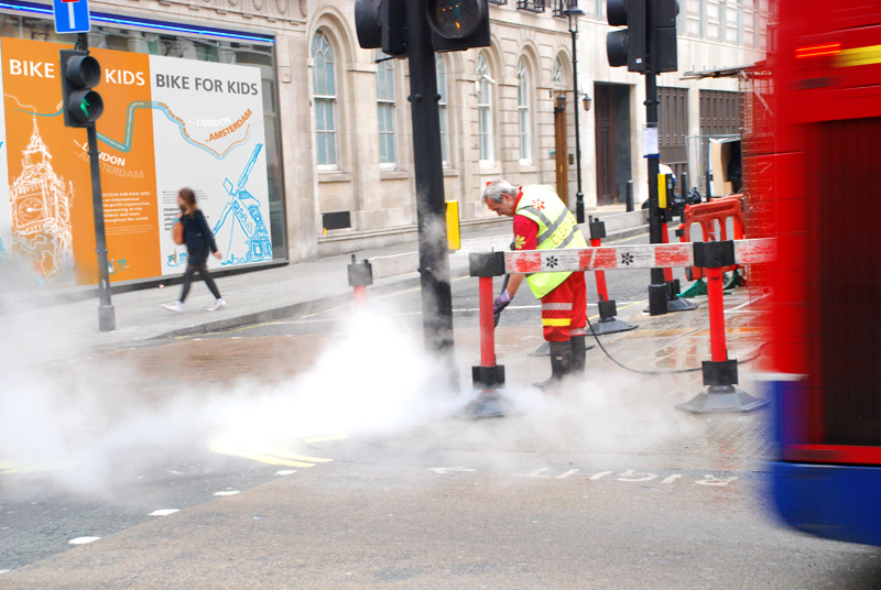
Lines resembling bike trace were one of the key elements in both logo and poster design.

I joined this bike ride myself. Needless to say - it was EPIC!
________________
* SFK is an international non-profit organization, empowering at-risk children and teens throughout the world.